The graphic sign, commonly called logo, is, as I have already mentioned, one of the most important elements in contact with our customers and business partners. For some time now this has been noticed by cities and provinces in Poland. Thus better and worse logos started to appear. In this text I would like to tell you about five best logos in my opinion.
Place 5 Podlaskie Voivodeship
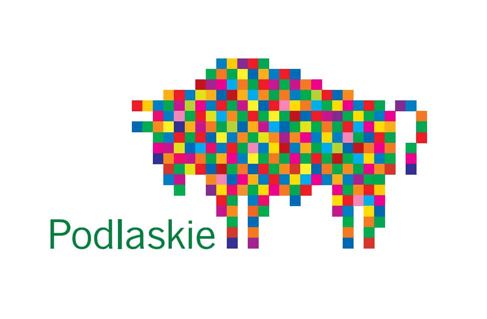
The list of the best logos, in our opinion, opens with the Podlaskie region with its wisent. The Podlaskie Voivodeship brand logotype was designed by Professor Leon Tarasewicz, born and living in the Białystok region. The design is very positive, simple in its message. It does not contain hidden meanings, but it attracts attention and thanks to its simplicity will remain fresh for a long time. What, in my opinion, is the problem of this pattern is the lack of a meaningful application on materials with a coloured background. Neither the black nor the white bison looks so special anymore because all its strength lies in colours. And yet, they do not make a grid out of it. Nevertheless, it is one of my favourite and, when looking for materials for this design, underestimated patterns.
Place 4. Voivodship Łódzkie (before changes)
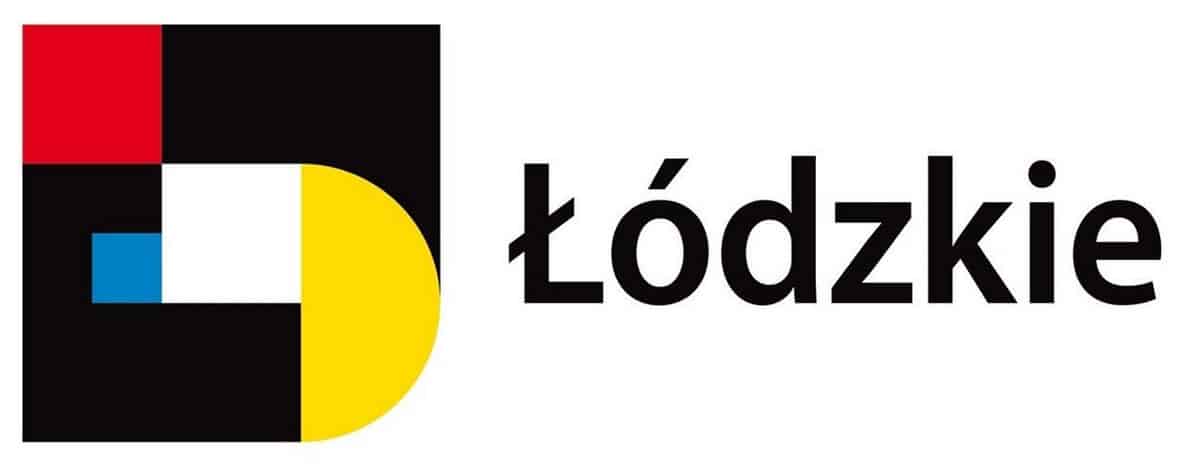
The logo was created in 2013 by Bogumiła Drozdowska. The symbol directly refers to the Bauhaus style. The colours and simple shapes are the domain of one of the most recognisable styles in design. If you look closely, you will notice the letters "Ł" and "D" in the logo, and with a bit of goodwill and freezing eyes, the other letters. The logo is simple and immediately strikes one's memory against the background of colourful signs of other voivodeships and cities. In addition, it was very elegant and, in my opinion, quite well reflected the spirit of this exceptional city. I am writing "was" because by the decision of those in power it was changed into such a design (https://www.lodzkie.pl/urzad/system-identyfikacji), which may be included in my list of the worst changes.
Place 3 City of Katowice

I found somewhere that this is the best logo in a similar set. I have a different favourite, but I have to agree that both the design by Wojciech Janicki, a lecturer at the University of Arts in Poznań, and the slogan are very accurate. We associate Silesia with chimneys, factories and coal. Just like Katowice. Here, however, the reference to the mine was placed at the bottom as the grey part of the heart, and the top was devoted to skyscrapers, friendly and climbing up as a symbol of modernity. The whole, of course, enclosed in the shape of a heart, i.e. presenting this place as one to fall in love with.
Place 2. City of Poznań (before changes)
In my opinion, it was an extremely poor move to remove the phrase *city of know-how from the logo of Poznań. Now, as the editor of TVN24 aptly pointed out, the city no longer has the know-how. And I agree. The whole strength of this logo was that Poznań is a city focused on modern technologies. Both to accept them and, above all, to focus on their production. And it was very well played out. The asterisk (laser beam) making a dash above the "ñ" was played out as a very popular form of explanation below. The logo was modern and imaginative. You could feel that this city was betting on modernity. Unfortunately, after the change it became ordinary POZnań.
Place 1. City of Łódź
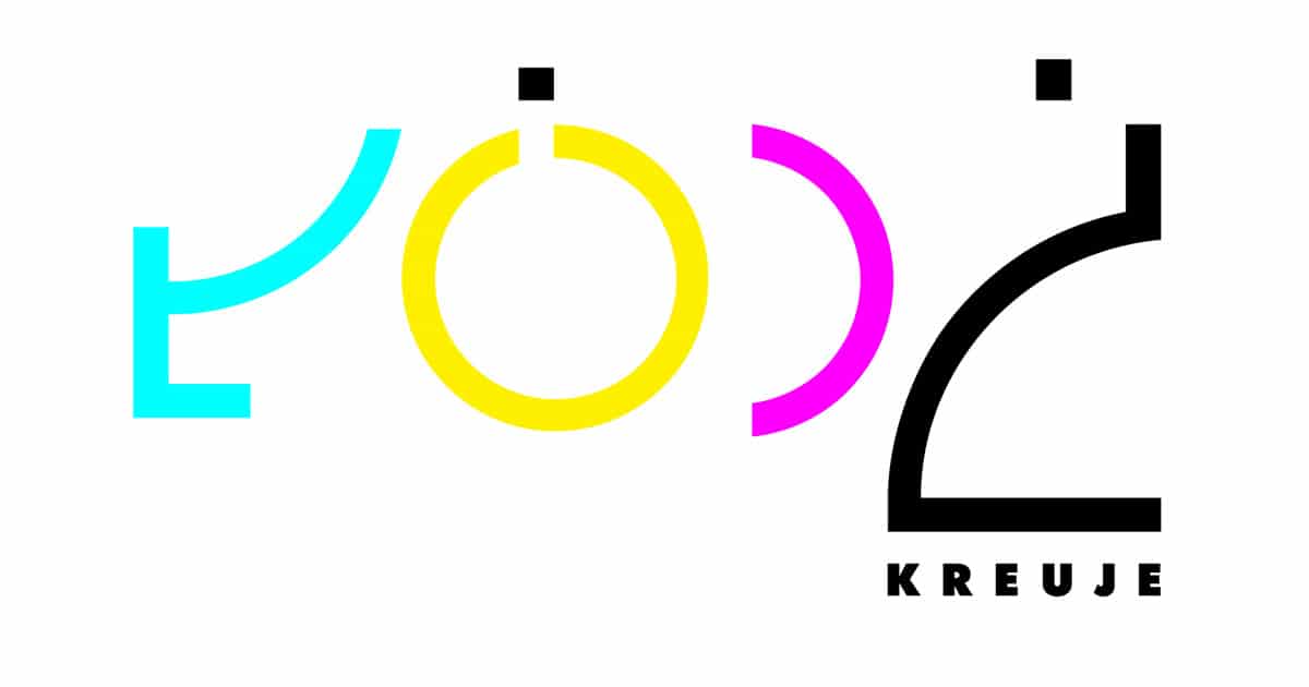
And it is Łódź again. The approach of the authorities to this city and the way it is presented is very good. The current logo shows Łódź as a modern city, focused on culture, open and with a certain distance to itself. Justyna Żychalska designed the bold colours and residual typography in which many references to the city itself and its history can be found. And what proves the strength of this design and the sense of aesthetics of those who chose it, it has been with us for 9 years and is not about to change, and was chosen unanimously from among 75 other works.