Everyone who deals with designing, whether for the Internet or for print, knows how important the role of colour is. If the palette is not imposed on us by the client we have practically unlimited possibilities. However, to do it right it's worth knowing some rules and places on the web, which will help us in choosing the flawless colour scheme.
You can rely on your sense of aesthetics. By matching one colour to another, shifting stripes of hue and brightness. There's nothing wrong with that, and it often results in unique colour combinations that work on our sense of sight. However, there is nothing stopping you from trusting one of the tools I have presented. You won't lose anything, and maybe you will be inspired? Maybe you will create such a combination of colours that thanks to them your project will stay in the recipient's memory for a longer time? I recommend.
Pigment
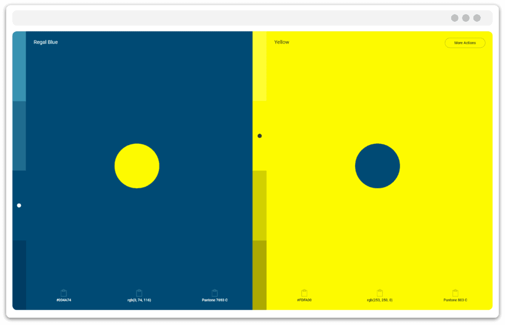
What captivated me about this tool was the presentation of colour combinations. The design of the tool is seemingly simple, even ascetic, but thanks to that it is focused to the maximum on exposing the most important thing - colour. When we select a particular colour combination from the palette, a full screen opens up, where even when we move away from the monitor we can look closely at how the selected colours play together. https://pigment.shapefactory.co
Color.Adobe (formerly Kuler)
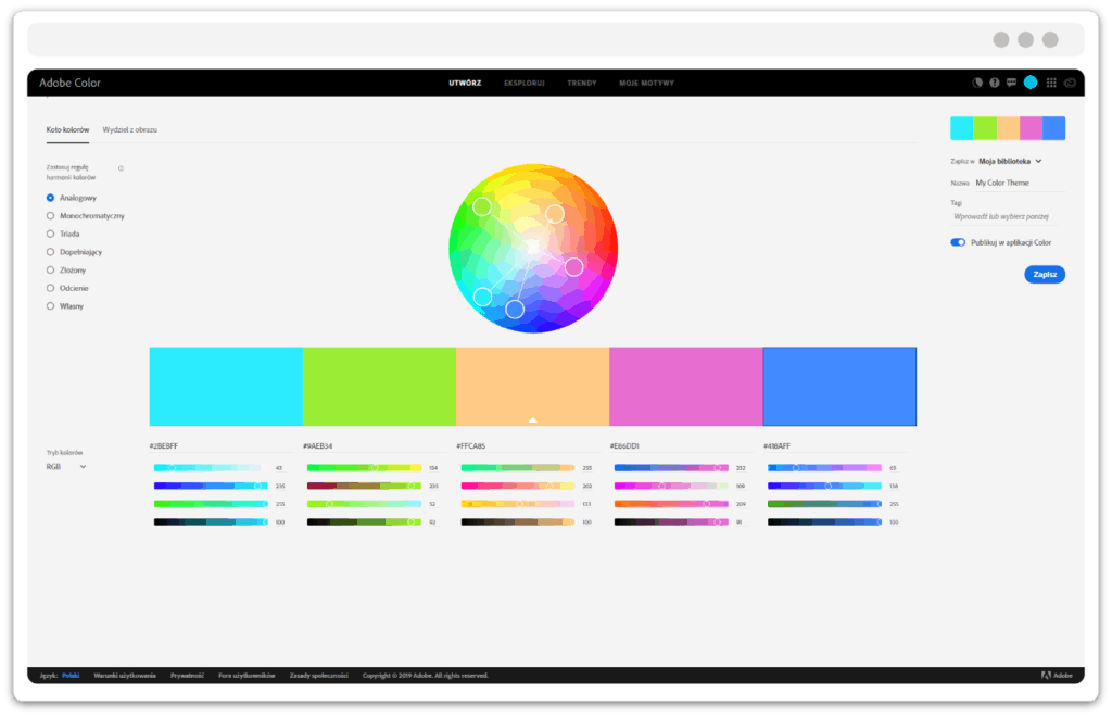
The tool provided by Adobe is quite an advanced system. The possibility of setting many variables influencing the combination of colours will satisfy even the most demanding ones. However, in my opinion, the tool itself serves more as an aid for advanced and determined graphic designers than as an inspiration. Right, in the background, there is a subpage with colour inspirations, but the colour mixer itself is an option that will simply allow us to correctly combine colours on the basis of the set parameters. It is less likely to inspire us by presenting a unique colour scheme. Nevertheless, I recommend it to everyone who feels like working with so many variables. https://color.adobe.com/pl/create
Canva Color Wheel
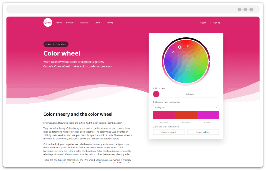
What I particularly like about this simple colour picker is its presentation in the top of the page template. Thanks to that we can immediately see how the colour looks on opening a new project in its full glory. Admittedly I miss here a bigger influence on gradient, i.e. colour transition, but it doesn't hurt to check this tool. https://www.canva.com/colors/color-wheel/
Muzli Colors
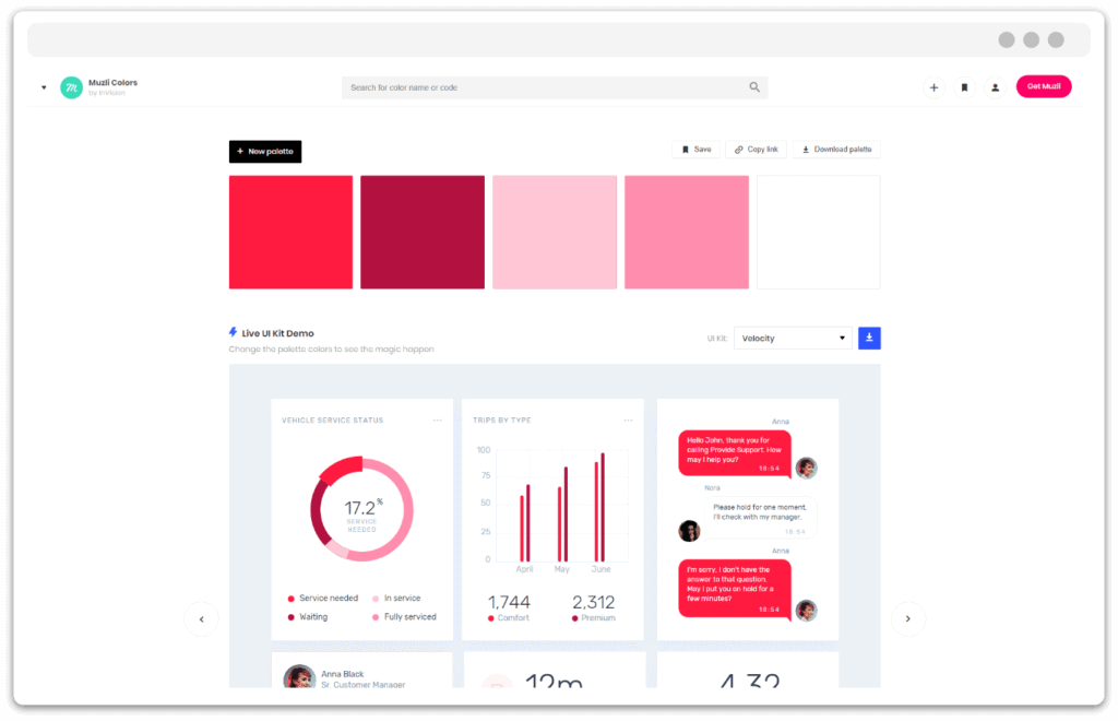
This seemingly inconspicuous tool, apart from the functions described elsewhere, has one undeniable advantage. Similarly to Canva Color Wheel, it can present colours on a live website. It extends this functionality by presenting colours in the templates of instant messaging applications, or something similar to SmartHome. Very useful tool when we want to quickly create a whole colour range with gradients and main colours of our project. I especially recommend this tool. A few simple moves gives us a sea of inspiration. https://colors.muz.li
Color Hunt

A simple page that gives a nice overview of the five basic colours of our projects. A large database of colour combinations prepared by other users will always let us find something really nice. I especially recommend this site to people who want to quickly determine the colour direction of their project. You can refine it later, but at first glance it's a nice thing. However, the tool will not tell us how to combine colours correctly, so we will rely mainly on our sense of aesthetics or ideas of other Color Hunt users. https://colorhunt.co
Design Seeds
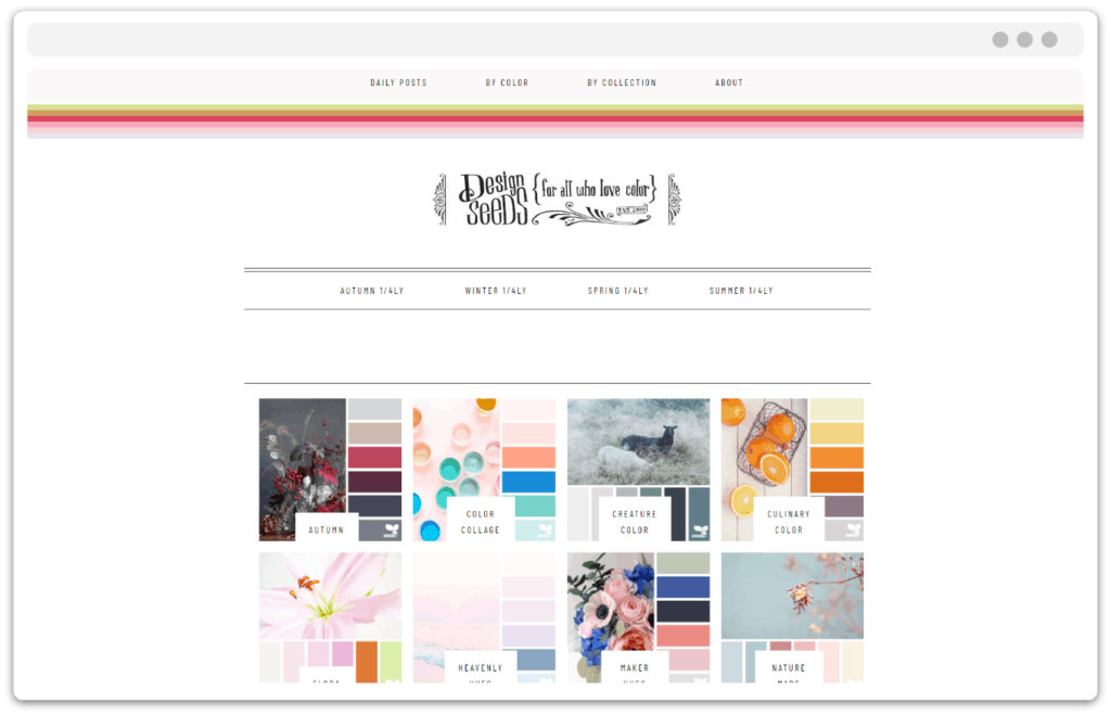
As the name suggests, this is a different approach to choosing colours. This is a site that instead of allowing us to choose colours, it presents everyday combinations and collections inspired by real photographs. A great place if we are looking for inspiration. Unfortunately it lacks the ability to upload your own photo, which could be transformed into a beautiful colour palette inspired by a real view. Fortunately, with such possibilities come mobile applications, which I will try to describe one day. https://www.design-seeds.com/
I hope I managed to inspire you in your search for the perfect colour! Have fun!